When AI answers before you’ve figured out the question
A difficult decision often isn't a lack of information. It's being stuck between competing priorities, emotions, assumptions, and impulses.
General-purpose AI can respond immediately and confidently, but sometimes the user doesn't need another voice making the decision. They need help seeing the situation more clearly.
Clarity, not control.
Gutly’s formula provides clarity. It does not make decisions for you.
The design problem
How do you make AI useful without making it authoritative?
A useful AI and an authoritative AI look similar on the surface. Both respond quickly. Both sound sure. The difference is whether the product leaves the person in charge.
The response is a sequence that stops one step early. Gutly can offer a perspective and a recommendation. It cannot take the decision. That constraint lives in the interface: the output is named a recommendation, confidence appears only where it is meaningful, and every answer ends with “Do you agree?” — not an instruction to follow.
User question
The mess arrives as-is.
↓→
AI perspective
A lens offers a way of looking.
↓→
Recommendation
A point of view — not an order.
↓→
User decides
The AI stops. The choice stays human.
The AI stops here
Framing
A hypothesis, not a research finding
Gutly began from a problem I experienced directly: using AI to work through confusion without losing the thread of what actually mattered.
This was an independently built and shipped product. I didn’t run formal user research or instrument the first release, so these were hypotheses rather than validated findings.
How do I let AI help someone think without taking the decision?
How much structure helps before it starts feeling like homework?
How do I communicate uncertainty without faking certainty?
How do I return the final decision to the user?
The lenses
One question. Ten ways of thinking.
I didn't organise the lenses around what the AI model could do. I organised them around how someone might be stuck.
GUT CHECK
GUIDED
QUICK
CHALLENGER
PROS & CONS
REFLECTION
REALITY CHECK
STANDSTILL
MIRROR
CLARITY CHAT
QUICK
“I need clarity without overthinking this.”
GUIDED
“This matters enough that I need to work through what actually matters.”
CHALLENGER
“I think I know what’s true. Push back on me.”
CLARITY CHAT
“I don’t need an answer yet. I need to untangle the problem.”
Ten lenses can itself become a decision. Smart Lens suggests one, explains why, and still lets the user override it.
The path
From stuck to clearer
Question
↓→
Choose how to look
↓→
Only needed context
↓→
Analyse
↓→
Recommendation
↓→
You decide
Clarity Chat branches from “choose how to look” — a conversation instead of a single analysis.
01
Write it down
The question can be typed or dictated.
02
Choose how to look
Ten lenses or Smart Lens.
03
Only what’s needed
Each lens asks only for the context it requires.
04
Sit with the answer
Recommendation, perspective, confidence where appropriate.
05
You decide
Agree, disagree, save, go deeper — but the AI never takes the final action.
Session IAScreen IAMembership IA
Structure
Three screens carry the core experience
01
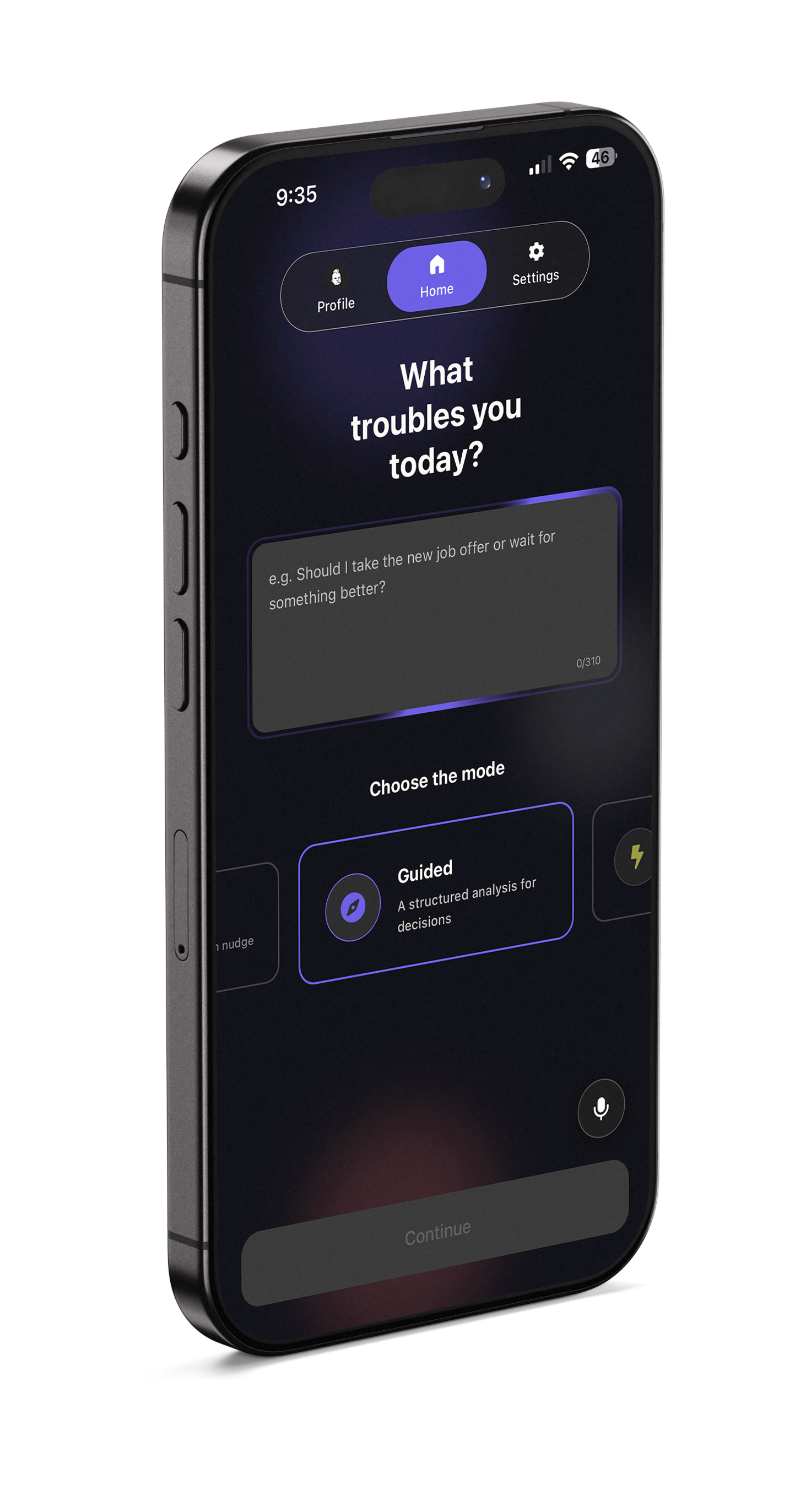
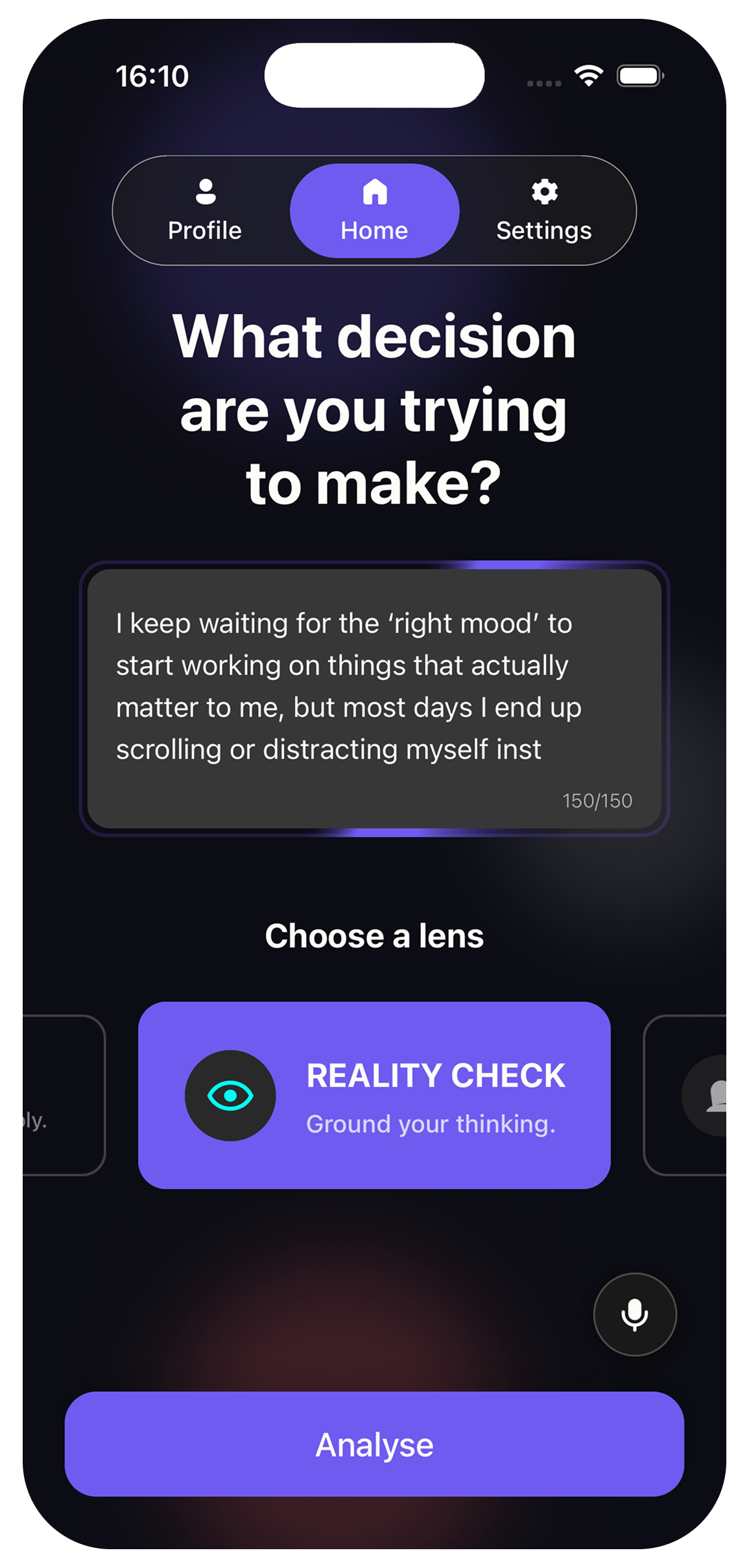
Home
One screen to write the question, choose the lens, and start. No setup flow before the user can think.
02
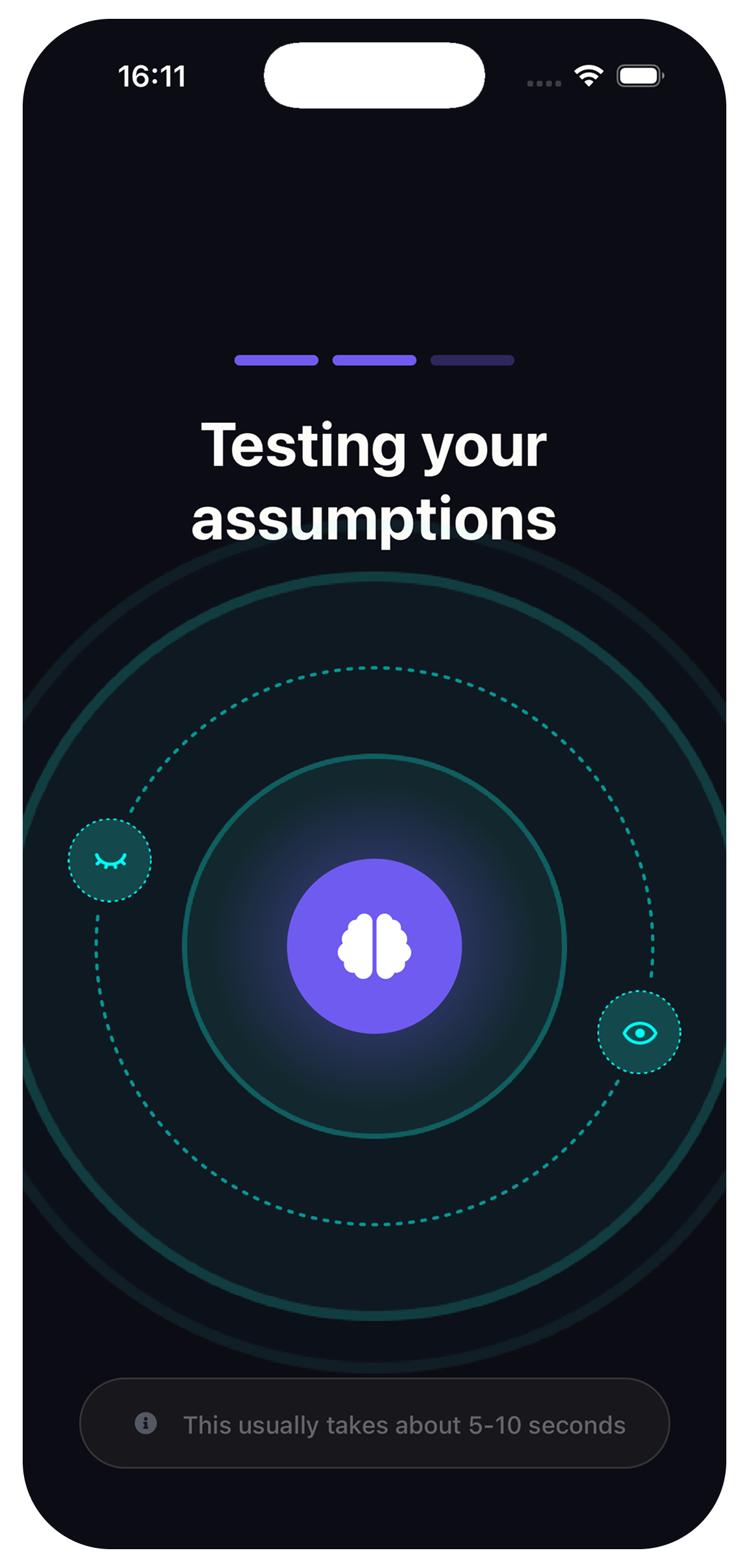
Analysing
The waiting state changes with the lens, giving the interaction a sense of purpose rather than showing a generic spinner.
03
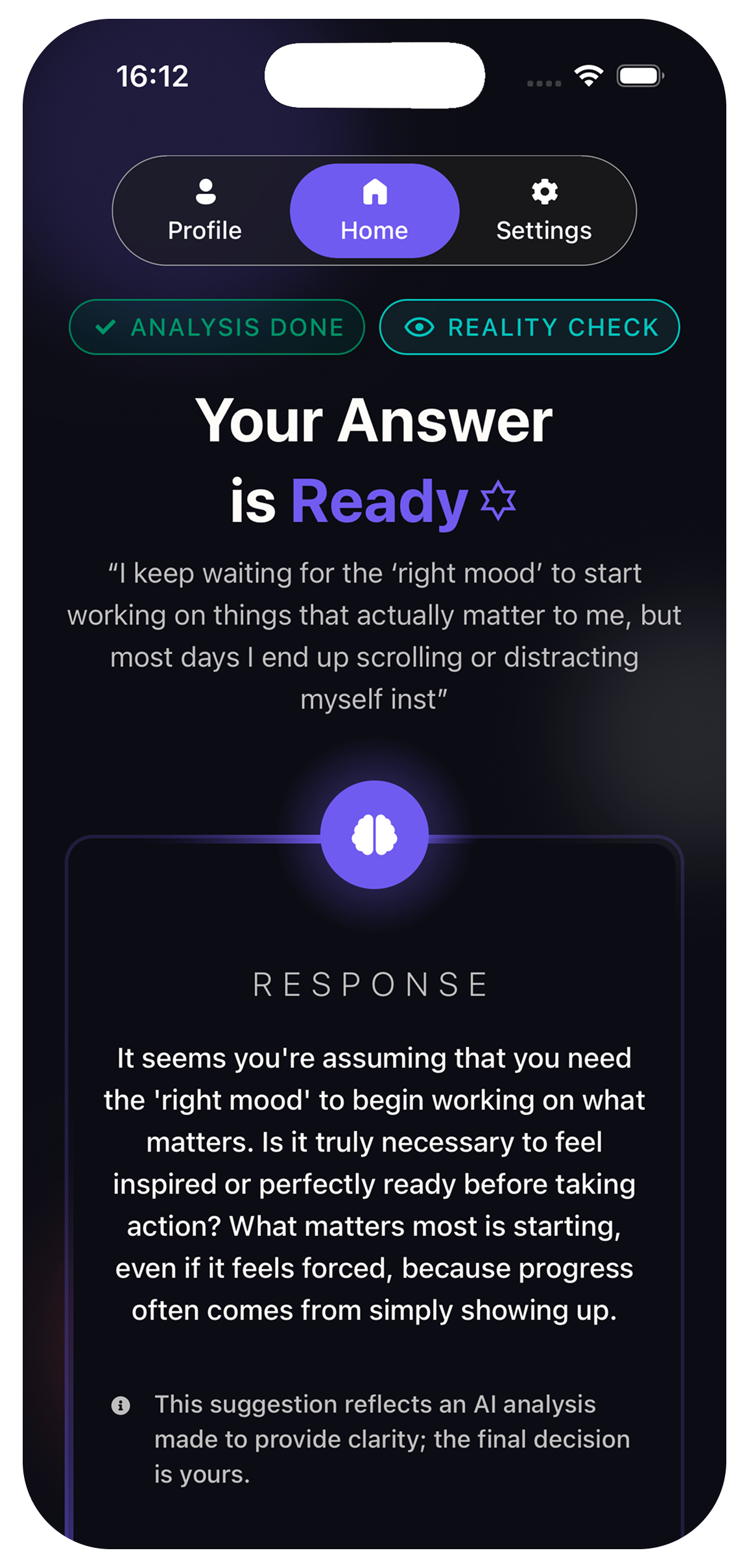
Recommendation
The output is explicitly framed as a recommendation. Confidence appears only where it is meaningful, and “Do you agree?” hands the interaction back to the user.
Decisions
Three decisions that still feel like the product
Decision 01
Recommend. Don’t decide.
The output is named a recommendation, not an answer. Confidence appears only where it is meaningful. Every response ends with “Do you agree?” — never an imperative to follow. The app is allowed a point of view. It is not allowed to take the choice.
Decision 02
Ask only what the lens needs.
Serious decisions need context. But putting the same questionnaire in front of every user kills momentum. Quick can go straight to analyse. Guided asks what matters and what’s in the way. Clarity Chat just starts talking.
Quick
Question↓→
Analyse
Guided
Question↓→
Priorities↓→
Constraints↓→
Analyse
Clarity Chat
Question↓→
Conversation
Decision 03
Ten lenses without creating ten settings.
The lenses are presented as ways of thinking, not configuration. If the user is already stuck, asking them to choose the perfect lens creates another decision. Smart Lens suggests one, explains why, and still lets them override it.
GUT CHECKGUIDEDQUICKCHALLENGERPROS & CONSREFLECTIONREALITY CHECKSTANDSTILLMIRRORCLARITY CHAT
AI interaction
I didn’t just wrap ChatGPT. I designed the interaction around constraints.
Each lens has its own rules for tone, length, context, and what it is allowed to do. The user never sees the machinery. They simply choose a way of looking and receive an interaction designed around that mode.
User input
↓
Lens + context
↓
Lens-specific AI behaviour
↓
Recommendation / perspective
↓
User decides
Guided
“Should I take the new job offer or wait?”
Priorities and constraints first. Then a recommendation, with confidence named in plain language.
Challenger
“I think I should quit because my manager doesn’t value me.”
This lens is allowed to push back. It questions the story — it does not issue an instruction.
Clarity Chat
“I keep going back and forth and I don’t know why.”
No single answer. A short conversation to unpick the knot before any recommendation is earned.
Visual system
A quiet visual system for noisy decisions
I kept the core interface restrained so the lens could provide differentiation without turning the product into visual noise.
Typography — GutlySans
Display
48 / 56 · 800
Display
Heading 1
35px · 700
Heading 1
Heading 2
25px · 600
Heading 2
Body
16 / 24 · 400–700
Body
Caption
14 / 20 · 500
Caption
Palette
Deep Indigo
Soft White
Indigo Blue
Charcoal
Warm Amber
Success Green
Lens colour
GUT CHECKGUIDEDQUICKCHALLENGERPROS & CONSREFLECTIONREALITY CHECKSTANDSTILLMIRRORCLARITY CHAT
Components
Primary button
Mode tags
GUIDED
Question input
Should I take the new job offer…
Confidence bar
Medium confidence
Feedback
AgreeDisagree
Lens card
GUIDED
Structured guidance
Considerations: Semantic controls · Screen-reader labels · Scalable type · Daylight mode. I have not run a formal accessibility audit.
The product
I didn’t just prototype it. I shipped it.
Gutly shipped on iOS and Android.
I also designed the membership model around usage, lens access, and retained history rather than scattering paywalls through the core experience.
Reflection
What shipping Gutly proved about AI product design
01
The breakthrough wasn’t adding more intelligence — it was designing where intelligence stops. Lenses, recommendations, and “Do you agree?” turned a principle into a product people could actually use.
02
Testing early builds with friends gave me the signal I needed. When someone was stuck, a named lens gave them a way in; handing the decision back kept the experience trustworthy. The product worked because the rules were visible in the interface — not buried in a prompt.
03
Shipping closed the loop from idea to App Store. Gutly is live on iOS and Android — and that early feedback sharpened exactly what to improve next: whether Smart Lens truly reduces friction, and when Go Deeper helps rather than piles on.
I didn’t run formal user research or instrument the first release for growth metrics. What I had was a shipped product, real sessions with people I trust, and enough evidence that the model works to take it further.