Concept
The solution
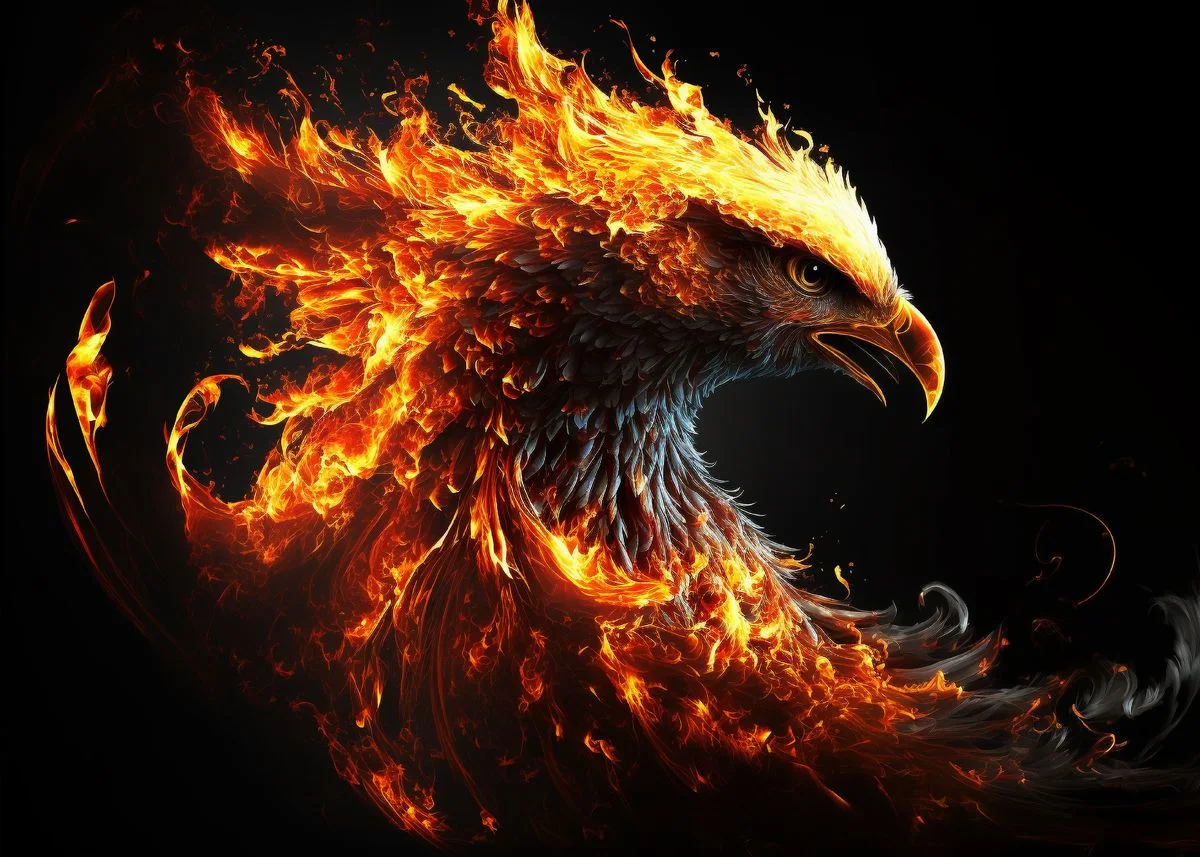
The identity is built around the phoenix—a symbol of rebirth and renewal used as strategic foundation, not decoration.
Rising suggests growth and progress. Fire represents inner strength and change. Rebirth speaks to continuous transformation—communicating the message instantly and emotionally, without heavy explanation.
Rising suggests growth and progress. Fire represents inner strength and change. Rebirth speaks to continuous transformation—communicating the message instantly and emotionally, without heavy explanation.